

In Pixar’s animated film Inside Out, a young girl named Riley struggles with her emotions as she and her parents adjust to life in a new city. Riley’s emotions are depicted as characters inside her — arguing, debating and making decisions about her life.
The emotion Joy wears a bright yellow-green dress; Disgust wears dark green and purple; Anger is red and sprouts angular flames from his head when he’s really upset. And Sadness — like the desperate subjects of Pablo Picasso’s blue period paintings — is blue.
As the creators of Inside Out and Picasso demonstrate, visual artists use colour and lines to depict emotions. It’s a practice confirmed by research that has identified consistent associations between certain colours and lines, and certain emotions.
Now, researchers from the Faculty of Arts & Science's Department of Psychology and their collaborators have confirmed these associations. In addition, they’ve shown that it is easier to predict the emotion being depicted with colour drawings than line drawings; and that emotion predictions are more accurate for colour drawings by non-artists than by artists.
“What we confirmed in our study was the systematic use of certain colours and lines to depict certain emotions,” says Dirk Bernhardt-Walther, an associate professor in the Department of Psychology.
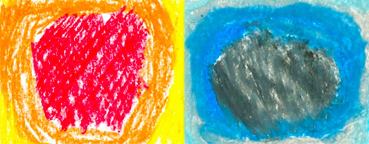
“For example, anger is depicted using red, or in drawings with densely packed lines. Sadness is blue and associated with vertical lines. We use these conventions to portray emotions — and observers perceive the emotions intended.”
The findings could help designers and visual artists convey emotions to users or viewers, or create architectural or designed spaces that evoke positive responses. It could also lead to a better understanding of visual aesthetics — how fine artists depict emotions in their work and whether it evokes the response they desire from viewers.

The study, Anger is red, sadness is blue: Emotion depictions in abstract visual art by artists and non-artists, was published in the Journal of Vision. The lead author is Claudia Damiano, a postdoctoral researcher with the Department of Brain and Cognition, KU Leuven, Belgium, and a former graduate student in Bernhardt-Walther's lab who conducted this work with Pinaki Gayen, a visiting graduate student on a Shastri Indo-Canadian Institute Research Fellowship. U of T co-authors include Bernhardt-Walther and postdoctoral fellow Morteza Rezanejad who is also from the Department of Psychology.
For the study, Bernhardt-Walther and his colleagues recruited 40 students from visual arts programs at OCAD University and 41 non-artists from STEM programs at the University of Toronto. All were instructed to create two abstract drawings — one using colour and one lines — for each of six emotions: anger, disgust, fear, sadness, joy and wonder.
The researchers began by validating the idea that distinct emotions were depicted in a consistent manner. First, they conducted computational analysis of the lines and colours in all the drawings. They then built a computational model that could predict the emotion from the visual properties of drawings by artists and non-artists.
They found that drawings depicting negative emotions tended to contain more lines and darker colours: red, blue, brown, black and gray. Drawings of positive emotions were less dense, had more curved or oblique lines, and contained brighter colours.
Images for joy were predominantly yellow-green; disgust, a darker green; anger, red; sadness, blue; and so on. The line drawings exhibited different styles of lines — from strong, intersecting lines for anger, to wavey and curved lines for joy.
The team also compared how artists and non-artists conveyed emotions with colours and found that trained artists generally used a smaller number of colours than non-artists and that the colours they used were unconventional. They also discovered that non-artists were better at conveying emotions through colour than artists.
“I believe the reason for this difference could be that non-artists tend to follow convention, whereas artists strive to be innovative, they want to do something distinctive,” says Bernhardt-Walther. “Artists know what the conventions are but they want to break from those conventions in order to provoke, stand out and create something special.”
The researchers also found that it is easier to guess the emotion a colour drawing is portraying than a line drawing. They speculate that this is because the associations between colours and emotions are stronger for us than the associations between lines and emotions.
And while the study did not delve into whether these associations are innate or learned culturally, Bernhardt-Walther draws on his own research and that of others and suggests these colour-emotion matches aren’t just culturally learned — in other words, we didn’t learn them simply from the paintings, illustrations and movies we’ve viewed throughout our lives.
“There is generally very good agreement on the association between colours and emotions across cultures that have developed independently,” says Bernhardt-Walther.
“There is consensus that red has significance because it is associated with blood, whether it’s your prey’s blood or your own. Our faces turn red when we are angry and gray or green when we feel nauseous. Darkness is scary because of the unknown danger.
“And in addition to being associated with sadness, blue is also calming — and the obvious association there is with the sky and water and being in the open where you are less at risk from a danger like a predator. We imitate these colours in artwork to specifically evoke these emotions.”
For Bernhardt-Walther, the current study is consistent with his growing interest in the effect of our visual environment on our emotions.
“I’m studying visual aesthetics more and more now as part of my research,” he says. “I want to know what people find aesthetically pleasing and why because I think it is an integral part of our perceptual experience. Liking or disliking what we see is directly related to how we think and how we perceive the world.”